­

About Craig Allen

This author has not yet filled in any details.
So far Craig Allen has created 103 blog entries.

Time to make your designs shine … literally!

March 23rd, 2019|Categories: Updates, Inspiration|Tags: , , , |

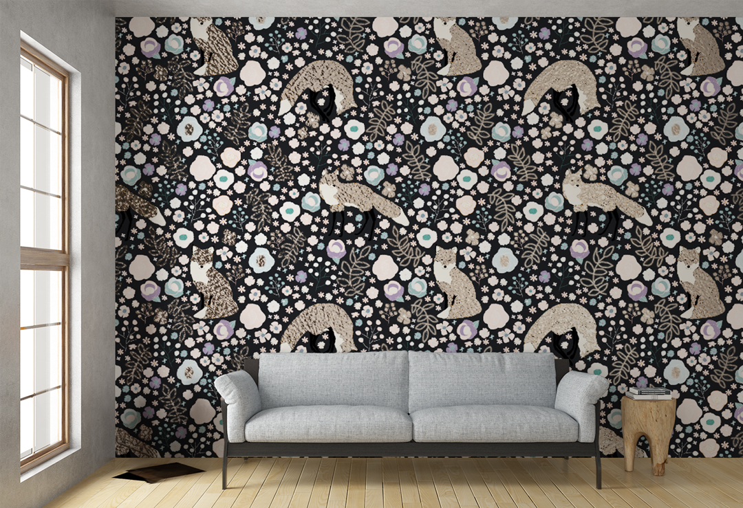
On March 21st, we were honored to help our friends at Koroseal host the latest SEGD member quarterly event. SEGD stands for Society for Experiential Graphic Design. Click here to learn more about Experiential Graphic Design and the SEGD. Experiential Graphic Design is a discipline where Graphic Designers help Architecture firms create welcoming and beautiful spaces. If you are a graphic artist of any kind, this is a great community to check out!   Koroseal, SEGD Members and WeaveUp staff discuss the benefits of the WeaveUp platform and how we help companies like Koroseal improve their work flows, and designers like SEGD Members create the perfect spaces with our Customization Tool. Earlier in the week, SEGD members got to test the WeaveUp platform by hand-selecting fun designs and putting them through our powerful Customizing Tool. Koroseal printed the designs on their privately developed and owned factory using the latest and greatest digital printing technology. Koroseal carries the best variety of commercial wallpaper in the US. Including amazing metallics that elevate any space's design. We couldn't help getting excited by the opportunities that digital printing on these amazing Koroseal products bring to our Independent Artists. Imagine someone's work being used in large spaces like hotels and high-end medical facilities!  Designer Tip: for metallic wallpaper applications, Koroseal's digital print technology replaces the white color in the design.   Koroseal products are available for the Architectural, Interior Design and similar trades. If you are interested in the Koroseal products for your commercial projects, you can locate your nearest representative here. Designs Featured in this Post

Create a Design in under 3 minutes!

February 22nd, 2019|Categories: Tips & Tricks, Design Basics, Inspiration|

If you are in the market for an easy way to create seamless repeats, and would like to spend a short amount of time creating them, you are in the right place! Start designing like a pro with this quick and easy video tutorial! You will need a version of Adobe Illustrator. Simply follow these quick and easy steps:

Playing with Fun Geometrics

February 21st, 2019|Categories: Inspiration|Tags: , , , , , |

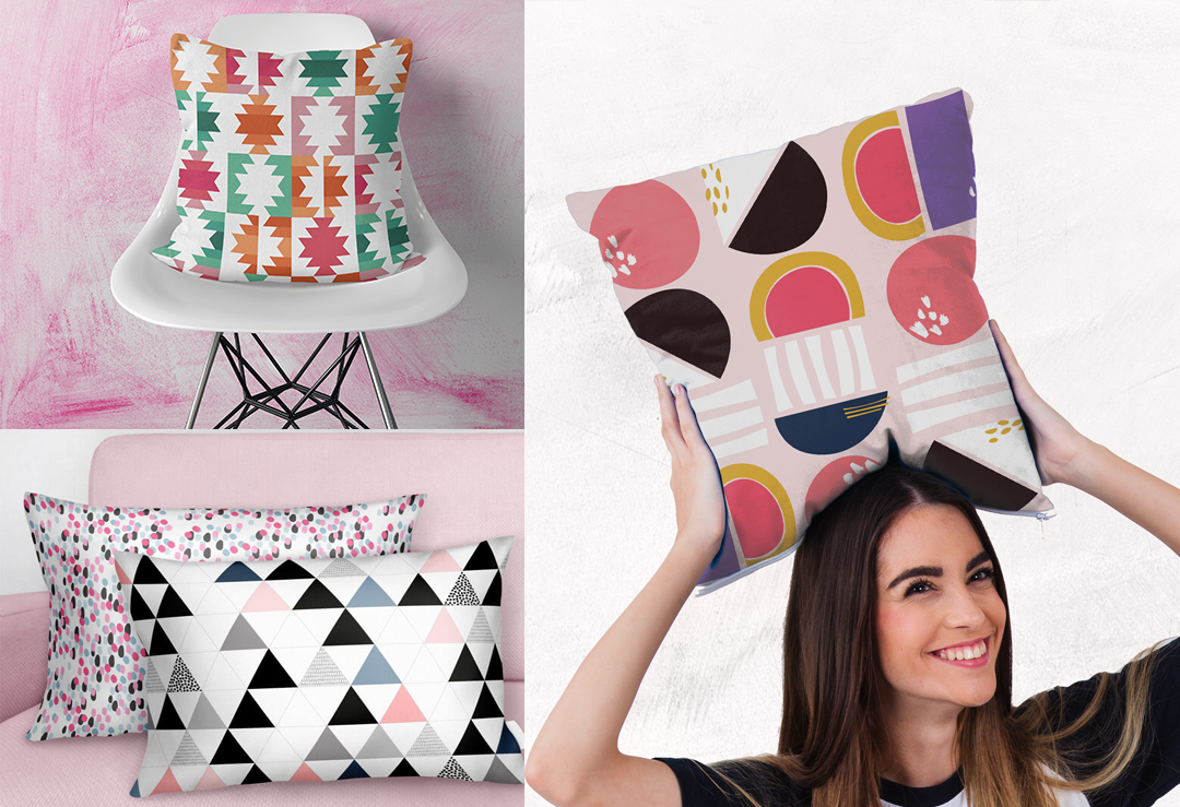
The always fun geometric presence is strong this season, suitable for home decoration and fashion, these types of prints are not only versatile, but super fun and clean. With our Customization Tool, you can change up the colors, scale and repeat of a design, a fun, bold design can easily be turned into a more sophisticated and grown up print: Here at the WeaveUp Headquarters, we've noticed a trend with fun geometrics, inside and outside of our community: Simple, clean decor with a punch of fun geometric provides the perfect balance between minimalistic and fun: Modern nature-inspired home decor with white walls, posters, cork accessories, wooden floor, bed, rack and green details Modern creative room decorated with wooden accessories Bright modern room with creative paper lamp and pastel decoration Ikea Designers and buyers have also been busy creating fun shapes with geometric feel: Ella and Fox Sarah Corynen Nancy Wolff  

Winter Collection

December 21st, 2018|Categories: Inspiration|Tags: , |

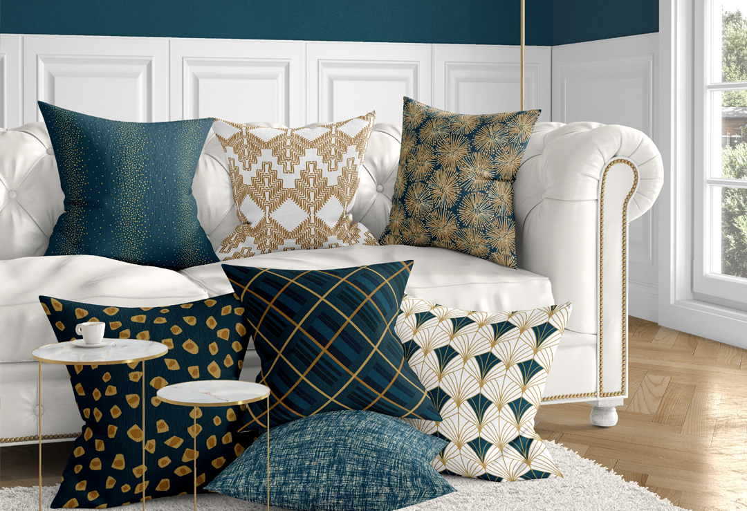
Did you recently visit our home page and noticed the lovely collection of pillows on the sofa? Believe it or not, most of those designs were created by various artists, and curated/color customized by our WeaveUp Design Team! We started by researching and selecting some fun colors: Then, found some prints that would reflect fun, winter, and sophistication, here are some of our favorites: Fans by BEM Splashed Out by Jessica Neira Handcraft A by byNevin Jagged Spots by Rana Yielding Lines by Monica Guerrero Checked 011 by MKDesigns Linen Texture by Sarah Gruber   Interested in viewing the entire collection? Here's a link to the Design Board!

Our newest partnership: JOANN

December 12th, 2018|Categories: Updates|

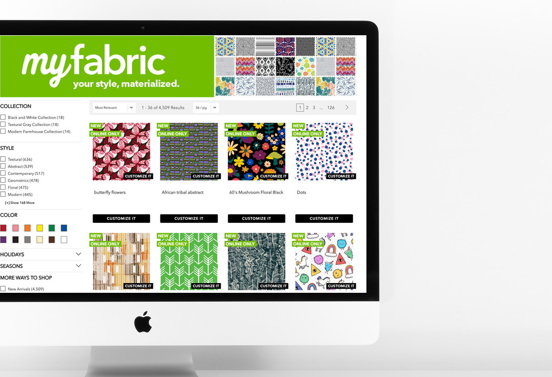
When you become a WeaveUp Independent Artist, we work diligently to introduce your designs to the widest possible global audiences. Some of our partners include Valley Forge Fabrics, Budget Blinds and Materialised. These partnerships give your designs more exposure, often translating to sales and can open doors to other opportunities. We are thrilled to announce our newest partnership with JOANN, the number one fabric retailer in the US! The program, called MyFabric, opens the door to a new era of creativity and design to millions of JOANN customers both in-store and online. How It Works: The WeaveUp Design Library is filled with beautiful, wonderful public designs created by Independent Artists from all over the world, like you. For this project, we collaborated with JOANN to hand-pick thousands of designs to be included in the MyFabric online program. Customers visiting JOANN.com can use our technology to customize designs by scale, repeat, and, in most cases, color.  The JOANN website receives over 10 million visits a month! The in-store version of MyFabric has launched in  select stores three WeaveUp-curated collections. With these collections, we demonstrate the power of our Customization Tool by coordinating independently-made designs by various artists. Customers can purchase these pre-customized fabrics in stores, or customize and order the designs online. This partnership is one of many that allows us to deliver on our promise to you, our Independent Artists, bringing exposure to your work in a fast-growing print-on-demand market where the possibilities are endless! Become a WeaveUp Independent Artist and your work has the potential to be featured in websites, show rooms, and stores around the globe with one of our partners! You can learn more about our partners by visiting our Partners Page. You can also learn more about becoming a WeaveUp Independent Artists with your original artwork by visiting our Artist Page.

  • learn how to digitize your hand drawn image and balance the light with Photoshop

WeaveUp’s Guide to Design: Balancing Light

July 26th, 2018|Categories: Inspiration|

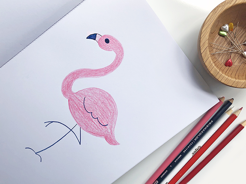
Learn how balancing light in your image will help you get better printed results. WeaveUp's Guide to design will teach you how to set up your work properly using various tools and design basics. We've broken this guide into a series of multiple short & simple posts that will be easy to follow and take you steps closer to creating the design of your dreams.  Lighting: Hand drawn or painted designs will need to be digitized somehow, typically, these designs are either photographed or scanned. Something to note about both is that various devices will have different outputs. The ideal form for WeaveUp is a resolution of 150DPI or above. Step 1 Digitize your image: For this post, we photographed this Flamingo drawing, and opened the photo in Photoshop. If you look close, the background of this image has uneven lighting.   Step 2 Adjust Brightness & Contrast: Open your image in Photoshop, then click on: Image > Adjustments > Brightness/Contrast. A Box will pop-open, using the sliders, give your image more light and contrast. Every image will need different adjustments, sliding the arrow to the right-hand side will increase the brightness and contrast, sliding it to the left will decrease it. Step 3 Using a Brush: sometimes the previous step is not enough to completely even out the lighting, in this case, we also recommend trying a soft brush. Step 4 Finishing Touches: Once the background's light is as even as possible, adjusting the brightness and contrast one last time will help finish this process.

  • WeaveUp Blog Post: How we curate designs

WeaveUp’s Design Curation Process

June 26th, 2018|Categories: Design Basics|

The design curation process guarantees a flawless selection of designs for our partners and more sales possibilities for designers. A great design is both beautiful and technically sound. In digital printing, what you see on screen is what will be printed on fabric. Therefore, we are selective when choosing designs to share with our partners. Each published design goes through a curation process, where we examine it for flaws. Appropriate designs may be shared with our commercial partners, while designs with technical issues will not. We reserve the right to  keep designs with major flaws unpublished. To help you to optimize your design’s potential, we’ve put together this post to explain some of the things we are looking for when we curate designs. Design Curation Process: what we look for in scale The best trick to scaling a design for WeaveUp is setting it at 150dpi and fit within 54”. Keep in mind that some of our clients are in Home Decor trades, where motifs are preferred to be large-scale. With WeaveUp’s Customization Tool you: Can reduce a design’s original scale. Can not increase a design’s original scale. Here’s what we look for regarding scale. Appropriate scale for the intended use: Designs should not be scaled too small, as our tool is unable to enlarge them more than the original file size. Optimal resolution and quality: Designs should be clean and sharp, and free of pixels and noise created by inappropriately enlarging the image. Design Curation Process: what we look for in repeats. Here’s what we look for in Basic, Half-Brick, or Half-Drop Repeats. Seamless Repeats: Elements in your design match along the repeat line. Spacing: Elements should be spaced well and no visible lines or large clumps between them. Rotation: Elements should be well placed and not duplicated too close together. Background: Pattern in the background, if present, should be seamless as well. Here’s what we look for in Mirrored Repeats. Cropping: Elements should be cropped appropriately, ensuring they aren not cropped at odd points. Shapes: All shapes created when repeated should be deliberate and not oddly met. Background Pattern: Should be repeating appropriately and not breaking when repeated. Design Curation Process: Line Quality The universal rule is that edges and lines, when present, are clean, continuous and free of stray pixels. When evaluating designs for line quality and noise, we consider the type of design and the artist’s intent. Here’s what we look for regarding image and line quality. Cleanliness: The design, including backgrounds, should be clear of any stray pixels or unwanted noise. Clear edges: The design should have clean, free of unwanted pixels and sharp edges. Smooth and straight lines: The design’s lines should be smooth, or show that curves and bumps are deliberate. Free of overly fine lines: When lines are too narrow, they break down in a different scale. Design Curation Process: Color The best trick for your design to be color-customizable is to create it appropriately, with 12 colors maximum and on a

  • Change the repeat of any design with WeaveUp

Change Design Repeats with WeaveUp’s Customization Tool

June 11th, 2018|Categories: Design Basics|

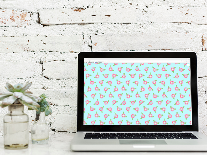
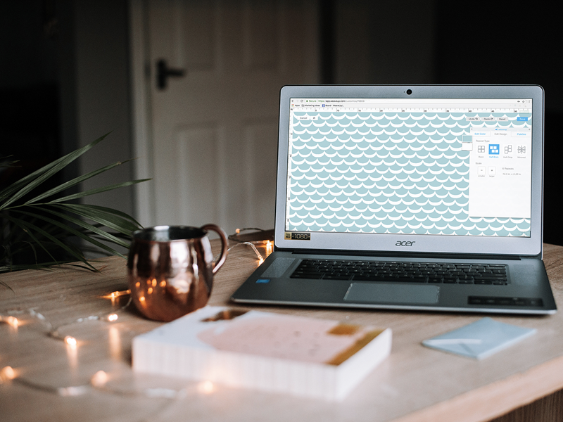
On our previous post, we talked about how to change a design's color. Most designs have an intended repeat, with the WeaveUp Customization Tool you can change design repeats. Let's take a closer look. Change Design Repeats.   Let's start by taking a look at the different types of repeats available at WeaveUp: Basic Repeat: Also referred to as a block repeat, this is the simplest repeat style. Your motif is designed as a rectangle that is repeated in a simple grid across the surface. 4-Way Mirror Repeat: This repeat style mirrors your motif both vertically and horizontally. Half-brick Repeat: This repeat style most closely resembles a brick wall. Your motif is repeated in rows, with each row stepping sideways halfway. Half-drop Repeat: Imagine a brick wall rotated 90 degrees: that is a half-drop repeat. Your motif is repeated in columns, with each column stepping down halfway. Change Design Repeats to Basic. The majority of designs in WeaveUp have been created using Basic Repeats, especially when they have seamless repeats. Notice how objects repeat through the area evenly. Geometric design, notice how everything repeats evenly using the Basic Repeat. This simple design repeats evenly throughout. Floral Design, notice how everything repeats seamlessly using the Basic Repeat.   Change Design Repeats to 4-Way Mirror. While not all designs will work with this repeat style, it is a good tool to use when a design is not set up with seamless repeat. Change design repeats using this mirror look and get completely different results. Notice how this "waves" design made some ovals/geometrics by simply changing the repeat to mirror repeat. Geometric design, notice how each triangle is facing each other, changing the look from triangles in squares to diamonds. These triangles create a whole new look when set up in mirror repeat. Floral design, notice how some of the flowers overlap with the next, this is because the edge of the image is intended to repeat seamlessly.   Change Design Repeats to Half-Brick. Change design repeats using this option, and see how the objects shift 50% to the left. Below are a couple of examples of this repeat: This design is one triangle in the center of a solid color square, therefore it looks evenly when you use the repeat.  Geometric design, notice that because the objects are in a perfect square, the design works in this repeat.. Floral design, because this design was created with a seamless, basic repeat, the objects will break up when repeating on this setting, breaking the design.   Change Design Repeats to Half-Drop. With this option, you can change design repeats by moving the objects in columns and dropping them 50% down. This is a great repeat to use for designs that have the objects in the center, for example, polka dots, triangles, and certain geometrics. Notice how setting up this repeat for this simple design allows for the objects to repeat in an even manner. Notice how there does not seem to be any change to the way this design repeats

  • change design colors with WeaveUp

Change Design Colors with WeaveUp’s Customization Tool

June 4th, 2018|Categories: Design Basics|

You can change design colors with our WeaveUp platform! Assuming that a design has been Optimized {click here to learn more about this},  you can change the color, repeat and scale. We use LAB and RGB/HEX Color Settings, the biggest difference between the two is that you can find more color values on the LAB space than you can  on RGB/HEX. There are many ways to change design colors in our platform, let's take a closer look. Change Design Colors. Current Colors. If the design is customizable, you will see all the "color chips" appear on this tool. On each color you will have the option to "Copy" it with the color-drop icon, or "Paste" a color with the drop icon. LAB Values. If you are working with our Huesteria Palette or Mini Guide, you'll notice that we use LAB colors. We explain LAB colors below: L for lightness: 0 to 100, zero represents darkness, therefore one hundred represents lightness. A for green to red: -128 to 127, the lower the number, the greener it gets. If you want more red, then, the number should be higher. B for blue to yellow: -128 to 127, the lower the number, the bluer it gets. If you want more yellow, then, the number should be higher.   This is a LAB Color Value Chart   Color Picker. If you prefer to move the mouse around, the color picker is right for you! Simply move and slide the small circle around the color wheel to find the color you are looking for. When the selector moves, the numbers around the tool change, therefore changing the design colors to what you select. Lightness Slider. This slider will show you different versions of the color you selected from lighter to darker. RGB Values & HEX Codes. These are very tightly related, they both live in the same color space. As one writer added to their blog post: "HEX color code is shorthand for its RGB values with a little conversion gymnastics in between".  We explain RGB colors as follow: R for red: 0 to 255, if the number is closer to 255, then it will have more red. G for green: 0 to 255, if the number is closer to 255, then it will have more green. B is for blue: 0 to 255, if the number is closer to 255, then it will have more blue. My Colors. Create your own palettes! As you work with the designs, you can save colors. Clicking on the "+" sign, you can add up to 12 colors to each palette you create. Saving Your Own Palettes. This tool makes it easier to create collections, make coordinates, and save your favorite colors. Featured Palettes. Select from our Pre-Curated Palette Collections. The image above, shows how a design can be changed in 6 different ways. 

  • Make money selling on WeaveUp

Make Money selling on WeaveUp

May 23rd, 2018|Categories: Tips & Tricks|

Here at WeaveUp headquarters, we often get questions about commissions and how they are structured. While a lot of this information can be found in our FAQ's page, we thought it might be nice to dive a little deeper into the commissions world, and, what you can do as a designer to maximize those. The first thing to note is that we work with various clients, some we call "Consumers" and some we call "Partners." While there are many differences between the two, the most notable differences can be explained below: Consumers: can be anybody on our website including yourself, independent of what type of business they are in or the purpose of their order. Orders placed by "Consumers" earn you 10% on the first 200 yards, and 3% on each additional yard after that.* Partners: are commercial clients, who have service terms with us. Our partners include from commercial manufacturers, retailers, and, everything in between. Orders placed by "Partners" earn you 3% of the sale.* The above chart explains the commission difference between sale to a consumer vs a sale to a partner.  Maximize your chances There are many things you can do to maximize your earnings. Here are the top three: 1. Promote your work: We often receive requests from our manufacturing and retail partners to curate design boards for them. Our Design Team is often putting together collections to help promote your work based on their needs. The beauty of our platform is that if you design is color-editable, it makes it easy to coordinate with other designs in our website, creating unique, sometimes unexpected collections. As a designer, you can promote your work in social media and within your design circles. Here are some tips: Social Media: Instagram is a great place to add your designs, and tag @weaveup, this gives our Social Media Team a chance to find your posts, and, #repost them if possible. If you aren't following us, our Instagram Handle is WeaveUp. Click here to view. Pinterest boards are an amazing place to showcase your work and your favorite designs in our website. Our Pinterest account is full of design inspiration, designer shout outs, and links back to our pages. We are also on Facebook, so be sure to tag us when you share your work there. If you "follow" our page and you're a designer, we'll be sure to follow you back! Your WeaveUp Profile: Enrich your profile: Let customers and other artists know who you are! Upload a headshot, include a link to your website, and write a personal description. Revealing your real name and location via our profile controls creates a tighter connection with other WeaveUp users. Writing great design descriptions: Give your designs a dash of personality with an inspired description and a fun, meaningful title.  Learn more about creating a great design description here. Use meaningful tags: The design tags you select during upload support our search tools; ensure that your designs are tagged as accurately as possible so that