February’s month of fashion has kicked off with a strong showing so far from the New York runways. And one thing has become abundantly clear: there’s a new color trend in town. Nearly everywhere we looked, shades of orange held court.
While orange has traditionally been viewed as a tricky color to pull off, NYFW has proved that there’s a shade to suit everyone. We’ve seen just about every orange imaginable hit the catwalk this past week. Don’t shy away from experimenting with this trend!
You may have scrolled by a pattern called Solid in our design library. It’s certainly not flashy, but did you know that it’s our best selling design? Our color customization technology, paired with our Huesteria Palette, means you can create the perfect solid. No more scanning limited shop shelves in disappointment, now you can envision and instantly generate your own perfect shade of orange.
To get you started, we’ve identified four NYFW-inspired directions to help you incorporate this color into your closet.
Harvest Orange

Jason Wu | Simon Miller | Lacoste | Elizabeth and James | Photos courtesy of Vogue
This is for those of you with classic style: you’re sophisticated yet you are still on top of the latest trends. These lighter oranges range from the sandy yellow end of the spectrum with marigold and ginger to the more saturated tangerine and carrot. Earthy and natural, these oranges make a simple, chic statement. We picked some of our favorite shades from our Huesteria Palette: here, here, and here.
Peach Orange

Proenza Schouler | Christian Siriano | Rosie Assoulin | Jil Sander Navy | Photos courtesy of Vogue
So maybe you’re really not a fan of orange but you don’t want to be out of the loop. Well, this next range is for you. The pink undertones subdue the yellowy sunniness and give these oranges a subtle elegance. Think muted coral, salmon, and vermillion shades. You’ll still stand out on the street, but orange isn’t the first thing people will think of. Picking from the Huesteria Palette, we created some solids of peachy orange here, here, here, and here.
Bright Orange

Katie Gallgaher | A Détacher | Jeremy Scott | Naeem Khan | Photos courtesy of Vogue
Ok you daredevils, have at it. This is for everyone with a love of flamboyance! Indeed, these super saturated oranges are verging on neon. From tangelo and paprika to the more orange-red and tomato, these colors will make a dramatic impact. Shop our faves here, here, here, and here.
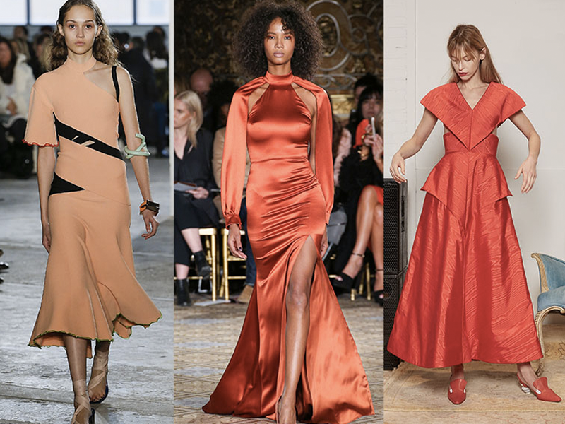
Dusky Orange

Nicholas K | Ulla Johnson | Brock Collection | Hellessy | Photos courtesy of Vogue
Now, for those prefer a darker palette, there’s no rule stating orange has to be bright! As the intensity reduces, these oranges begin to delve into the terracotta and brown spectrum. Tawny, rust, and burnt orange shades offer a somber nod to this jaunty trend. We picked our favorites here, here, and here.
Blue

Diane von Furstenberg | Monse | Tory Burch | Cinq à Sept | Jenny Packham | Photos courtesy of Vogue
While orange may have been the number one color trend this NYFW, blue has been a close runner-up. Many of the runways this past week have juxtaposed these colors in their collections, in separate looks as well as in combination!
Since orange and blue lie directly opposite each other on the color wheel, according to color theory they are deemed complementary colors. When paired together, complementary colors offer a sense of color harmony. The warmth of the orange is played up against the contrasting coolness of the blue. If you find the combination of the two hues a little dazzling, consider adjusting the saturation or brightness of the colors.
What do you think of the newest color trend? Tell us in the comments!
Leave A Comment