Often the defining element in a space, color has the ability to add depth and tone to a room but it can be difficult to know what colors belong where. With an infinite number of color combinations, where on earth do you start? We’re breaking down a few popular color schemes to guide your next project.
First, let’s get familiar with the basics. A hue is a property of color defined by distinctions within the visual spectrum, it refers the pure color itself, the generic name we all know (e.g. green, blue, violet). A color wheel, shown below, demonstrates the visual relationships between hues and is the basis for any color scheme.

When in the WeaveUp Customization Tool, shown below, you will notice a few ways to select a precise color. You can play with the color wheel and value bar to visually select your color. Alternatively, if you have your hands on an exact RGB, LAB, or hex value, you can input those numbers directly. We provide the LAB values on our Huesteria Mini Guide and Huesteria Palette, available for sale here. Using a color blanket allows you to see exactly how your color will print on any given fabric.

Now that you have a solid understanding of technical how-to, let’s discuss color palettes. There are a few schemes that will nearly always deliver beautiful results: monochromatic, analogous, and complementary. The more complicated schemes, split-complementary and triadic to name just two, are a bit trickier to perfect and require more time, but result in gorgeous, saturated decor.

Monochromatic: A monochromatic scheme includes various tones, tints, and shades of a single hue. Monochromatic is great for bedrooms and spaces where restfulness is important, but it can be a bit boring for larger, livelier living spaces.

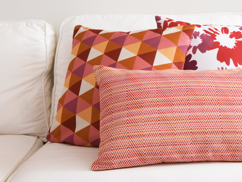
Analogous: An analogous scheme uses three colors adjacent on the color wheel: in this case, yellow, orange, and red. Analogous is pretty hard to mess up and results in a vibrant, cohesive look.

Complementary: Complementary colorways use two hues opposite each other on the color wheel; yellow and blue for example. Because of the contrast between the two hues, a complementary scheme can look quite jarring if you’re not careful. Be sure to keep your tones, tints, and shades similar across both hues to ensure a cohesive end look.

Split Complementary: A split complementary color scheme uses a hue and the two colors adjacent to the hue’s complementary. This colorway takes a bit of work to perfect but when done right results in a lively mix of hues.

Traidic: A triadic color scheme pulls three hues equidistant from each other on the color wheel. This scheme will result in a richness of color and contrast, but it can be tricky to find balance.
Feeling overwhelmed? Not to worry- there are tons of online tools to help designers and amateurs alike plan color schemes. Two of our favorites are Adobe’s Color Tool and Colour Lovers. If you’re interested in reading more about color and color schemes, check out these great references: a breakdown of basic color theory, NYU’s exploration of color, and further discussion of classic color schemes.
The pattern used above is called Global Matrix and is available on WeaveUp. Follow us on Pinterest for more color inspiration.
Leave A Comment