Last month, renowned optical artist Julian Stanczak passed away. To honor his memory, we’re delving into Stanczak’s journey and the story behind the resurgent optical illusion design trend.
Born in Borownika, Poland, Julian Stanczak’s family was exiled to a labor camp in Siberia during the Second World War. During this time, Stanczak contracted encephalitis, which permanently disabled his right arm. At age 14, Stanczak escaped Siberia, making the incredible journey all the way to a Polish refugee camp in colonial British Uganda. Despite facing so much adversity, Stanczak kept racing forward, pursuing art degrees, first in London, then later at the Cleveland Institute of Art, and finally at Yale University under the guidance of Josef Albers.
During this prestigious education, Stanczak honed his knowledge of color relativity and compositional dimensionality and his paintings began to gain traction as true works of optical magic. Indeed, the term “Op Art” first appeared in a 1964 Time magazine review by Donald Judd regarding one of Julian Stanczak’s first exhibitions. Only a year later, the Museum of Modern Art’s survey exhibition, The Responsive Eye, would herald the reign of the Op Art years.
What exactly is Op Art?
This stylistic term refers to a sphere of modern works specifically designed to produce surprising optical effects. Emerging in the 1960s, this movement drew inspiration from a number of sources: the non-representational shapes of geometric abstraction, the rhythmic movement of kinetic art, and classic techniques such as trompe l’oeil. As such, Op Art challenges the entire sensory realm of vision and perception, dramatically revealing the interpretive space between the eye and the mind.

Cataract 3 by Bridget Riley, 1967 | Source
The appeal of the Op Art style was instant and widespread. The characteristic visual effects could be seen in clothing, advertisements, and all manner of household goods. While some pioneering artists like Victor Vasarely embraced the mass consumption of this fine art trend, others, such as Bridget Riley, objected to the rampant and uncensored commercialization of her designs. By the 1970s, however, the Op Art movement had fallen out of favor, the oversaturated market and many art critics finally condemning the style for becoming too “gimmicky.”

Sign Sculpture by Victor Vasarely, 1977 | Source
While the heyday of the Op Art movement ended abruptly, Julian Stanczak’s artistic career continued to grow in depth and expertise. His works exploited disarming color combinations to create hidden layers while his use of geometric grids allowed him to imbue his pieces with vibrant movement. Many of his paintings feature ultra precise stiletto lines and highly refined variations of color. Stanczak was able to produce these works, despite his handicap, through pure technique, sheer experience and the dexterous use of tape. After many years of being overlooked by the artistic community, Stanczak’s astounding body of work returned to the spotlight in the 21st century.
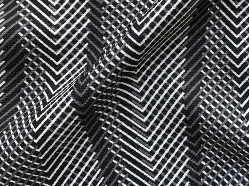
Here at the WeaveUp office, we love that the Sixties’ Op Art look is having a major style revival. As you can see in our pattern library, the optical illusion tag showcases an amazing array of contemporary interpretations. The print featured on the banner for this post was designed by JPanepinto, our resident optical illusion guru.
We took our two favorite Julian Stanczak paintings and let them inspire a selection of JPanepinto design colorways – check out the results below!

The Duel by Julian Stanczak, 1963 | Source

Twist & Bend

Tech Bark 2

Moire Grain 2

Forming in Four Reds by Julian Stanczak, 1994 | Source

Detail of Forming in Four Reds by Julian Stanczak, 1994 | Source

GEO 2

Hex 4

Double Diamond
What are your favorite mind-bending optical illusion designs? Share in the comments below!
Leave A Comment